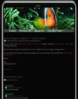
1. Good use of white space

 Good link for more information on "white space"
2. Poor use of white space
 Great before-and-after web page design link
3. Portrait orientation

4. Landscape orientation


5. Single column grid

6. Double or triple column grid
I wondered if this image (below) could be considered both
a single-column and a triple column grid. The reason is
that the pictures are in three columns, but the overall effect
is oneness (not to mention the text is all in one column).

 More info about grids
7. Mixed column grid

8. Heading flush with the text

9. Marginal heading
The heading (title) of this site is over the margin
(though not technically part of the margin itself).


10. Numbers or letters used for a list

11. Bullet, arrow, or other highlighting cue

12. Drop cap (initial character takes up more than one line)

13. Good ordering of information (showing relationship)

14. Poor ordering of information (no relationship or emphasis)

15. Citation style (i.e., MLA) or other visual convention
Footnotes with citation information:

16. Title and section head

17. Tabs or dividers

18. Headers or footers

19. Background/watermark
Background
 Background
20. Frame using solid or dotted lines
 Attractive web design layouts:Chocolate website design
